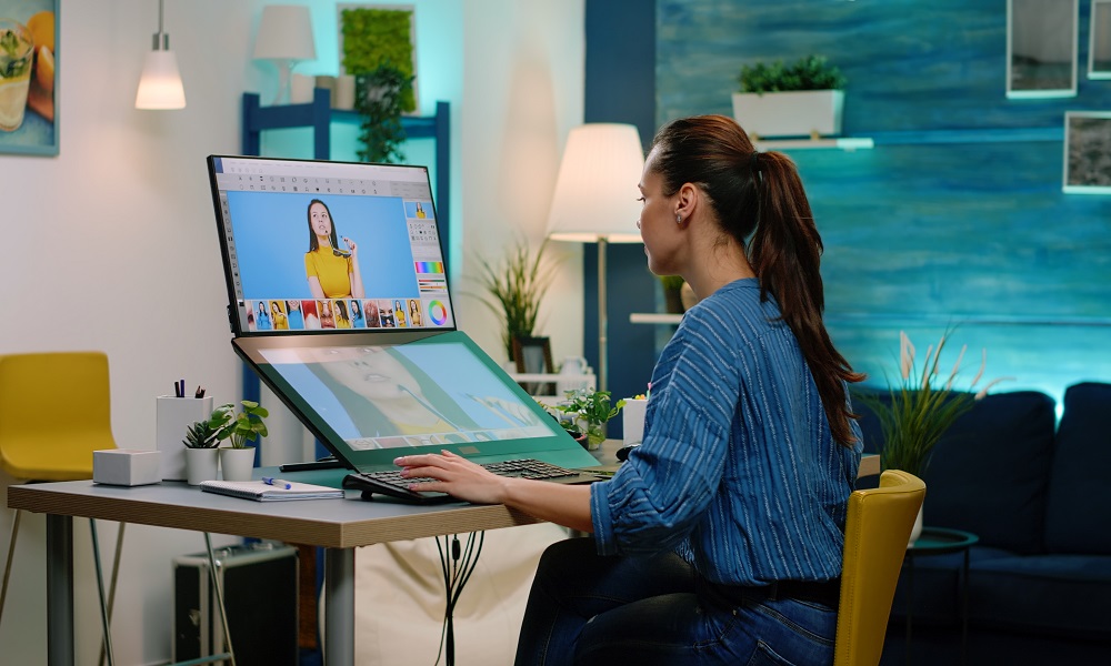
Texture is a powerful tool in graphic design that can add visual interest, depth, and tactile quality to your work. When used effectively, texture can transform flat designs into rich, engaging compositions that captivate viewers. Texture in graphic design refers to the perceived surface quality of a design element. It can be actual (physical) or visual (implied). In design, we primarily work with visual textures, which simulate the appearance of physical textures. These can range from subtle paper grain effects to bold, grungy overlays.
Types of textures
There are several types of textures you can incorporate into your designs.
- Natural textures- These mimic natural elements, such as wood grain, stone, or leaf patterns.
- Man-made textures- Include fabric textures, concrete, or metallic surfaces.
- Abstract textures – These are created patterns that don’t necessarily represent real-world textures but add visual interest.
- Geometric textures – Use repeating shapes and patterns to create a textured effect.
Adding depth with texture
The primary benefit of using texture in graphic design is the ability to add depth to your compositions. By layering textures or using them as background elements, you can create a sense of dimension that draws the viewer into the design. Experiment with opacity levels to achieve subtle depth without overwhelming other design elements.
Creating contrast through texture
Texture can be an effective way to create contrast in your designs. You can create visual interest and guide the viewer’s eye through your composition by juxtaposing smooth elements with rough textures or using textures of varying scales. This technique is beneficial when working with minimalist designs or monochromatic colour schemes.
Enhancing readability with texture
While texture can add visual interest, it’s essential to use it judiciously, especially when working with text. Subtle textures can enhance the readability of your text by providing a contrast to the letterforms. However, more complex or high-contrast textures can make text easier to read. Always prioritize legibility when incorporating texture into designs with text elements.
Balancing texture with other design elements
When incorporating texture into your designs, finding the right balance with other elements, such as colour, typography, and imagery, is essential. The texture should enhance your overall design, not overpower it. Consider the hierarchy of your design elements and use texture to support your main message or focal points.
Texture and emotion
Different textures can evoke various emotions and associations. Rough, gritty textures convey an edgy or urban feel, while smooth, glossy textures suggest sophistication or modernity. Consider the emotional impact of your chosen textures and how they align with your design’s intended message.
Adapting texture for different mediums
Remember that textures may appear differently across various mediums. A texture that looks great on screen might translate poorly to print or vice versa. Always test your textured designs on the intended medium and adjust as necessary to achieve the desired effect.
Staying current with texture trends
Like all aspects of design, texture trends evolve. Stay informed about current design trends and how texture is used in contemporary graphic design. However, feel free to experiment and develop your unique style when incorporating texture.
To further develop your skills in using texture, study the work of experienced designers and analyse how they incorporate texture into their designs. Various design fields see this technique applied effectively in various design fields, from print advertising to web design and packaging.